Various Companies

Branding

Bay Alarm Medical Re-Brand
In November 2024, I was requested by Bay Alarm to fully refresh their company branding where I completely reworked their look and feel. This re-brand included a fresh new color palette, new font styles, a social media strategy, updates to their previous logo and a complete overhaul of their company website. Bay Alarm Medical is a Medical Alert System company that's primary target audience is the senior community and family members looking to protect their loved ones. My goal
My Contributions
with the refresh involved giving the brand a more trustworthy, caring and a modern look when compared to competitors within their respective field. The company has been thrilled with the brand overhaul and I am currently in the process of refreshing existing and new assets alike with the new branding. Also checkout the Bay Alarm Medical Website Redesign I recently did!
Various music projects
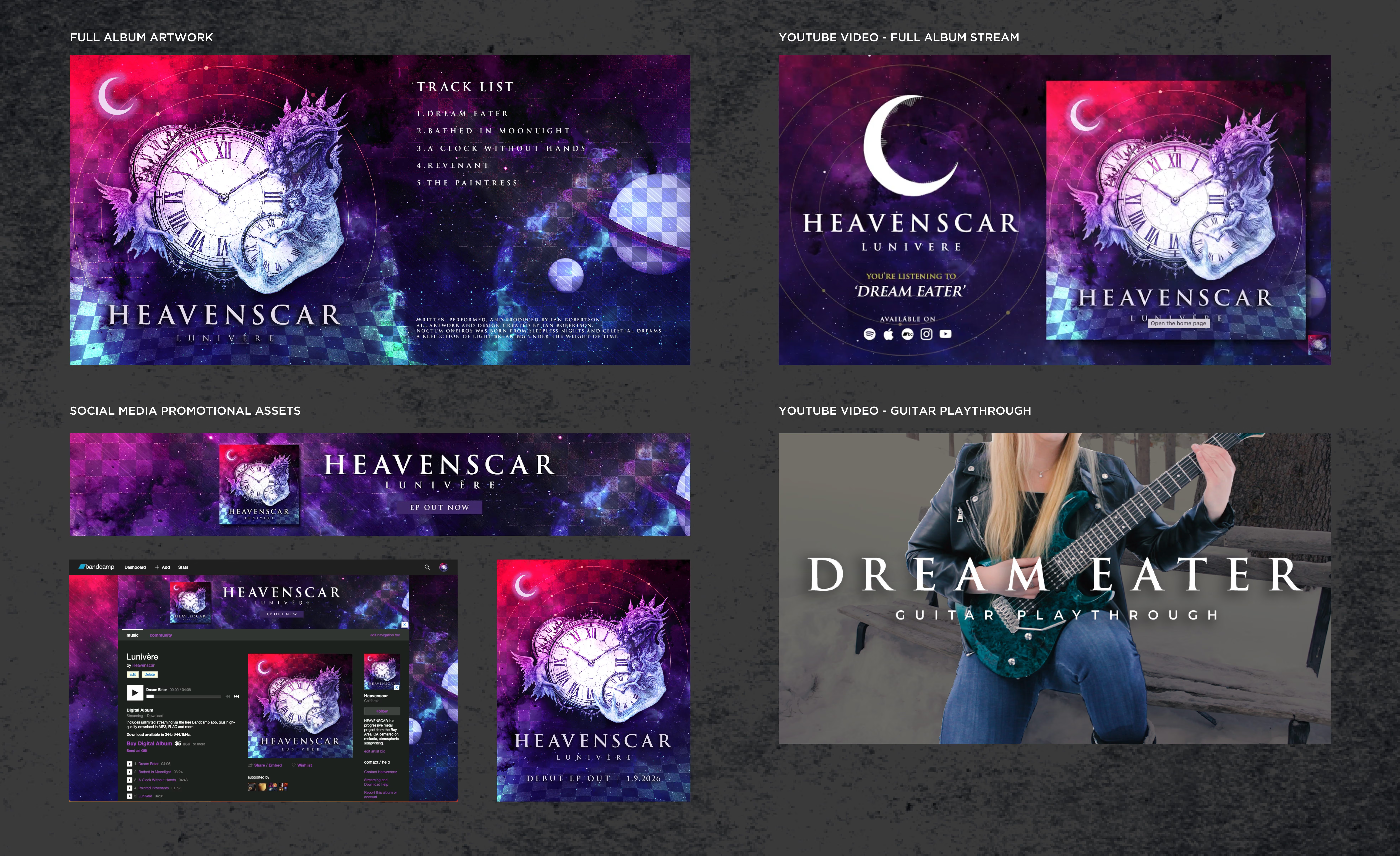
For both Heavenscar and Pharos, I was responsible for developing the complete visual identity for each music project, from the initial logo and album artwork to the full release campaign. This included cover art, tracklist layouts, promotional graphics, social media assets, streaming platform artwork, YouTube thumbnails, and Bandcamp branding. My goal was to create a cohesive visual language that reflected the atmosphere and emotion of each release while maintaining a polished,
My Contributions
professional presentation across every touchpoint. These projects allowed me to blend branding, illustration, typography, and digital marketing into a unified creative experience that supported the music from announcement through release.
Video & Animation
For both Heavenscar and Pharos, I created and directed video content to support new music releases across YouTube and social media. This included editing guitar playthroughs, designing animated full-album stream visuals, and adapting each release’s artwork into engaging video formats. I handled the visual direction, motion design, editing, typography, and overall presentation to help each track feel more immersive and connected to its larger brand identity. These videos gave the projects a stronger online presence while providing listeners with a more cinematic and emotionally engaging way to experience the music.
FAMILIAR AI - Logo Design
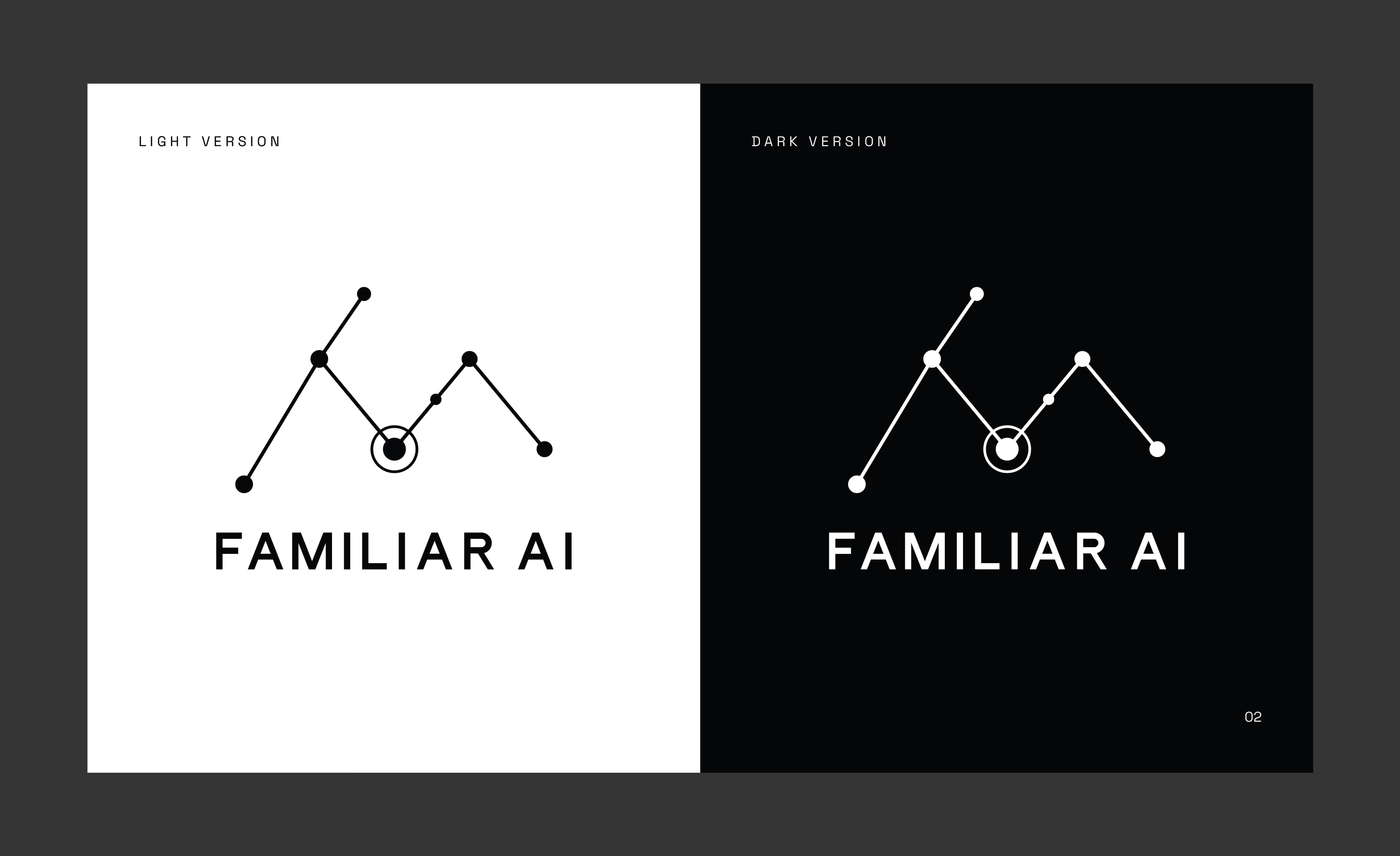
Familiar AI is a company that builds bespoke AI assistants for small businesses, solopreneurs, startups, and nonprofits, helping them create AI systems that understand their brand, goals, voice, and workflows. I developed a refined logo system centered around a minimalist Felis constellation mark, designed to represent a personalized AI network, celestial intelligence, and the
My Contributions
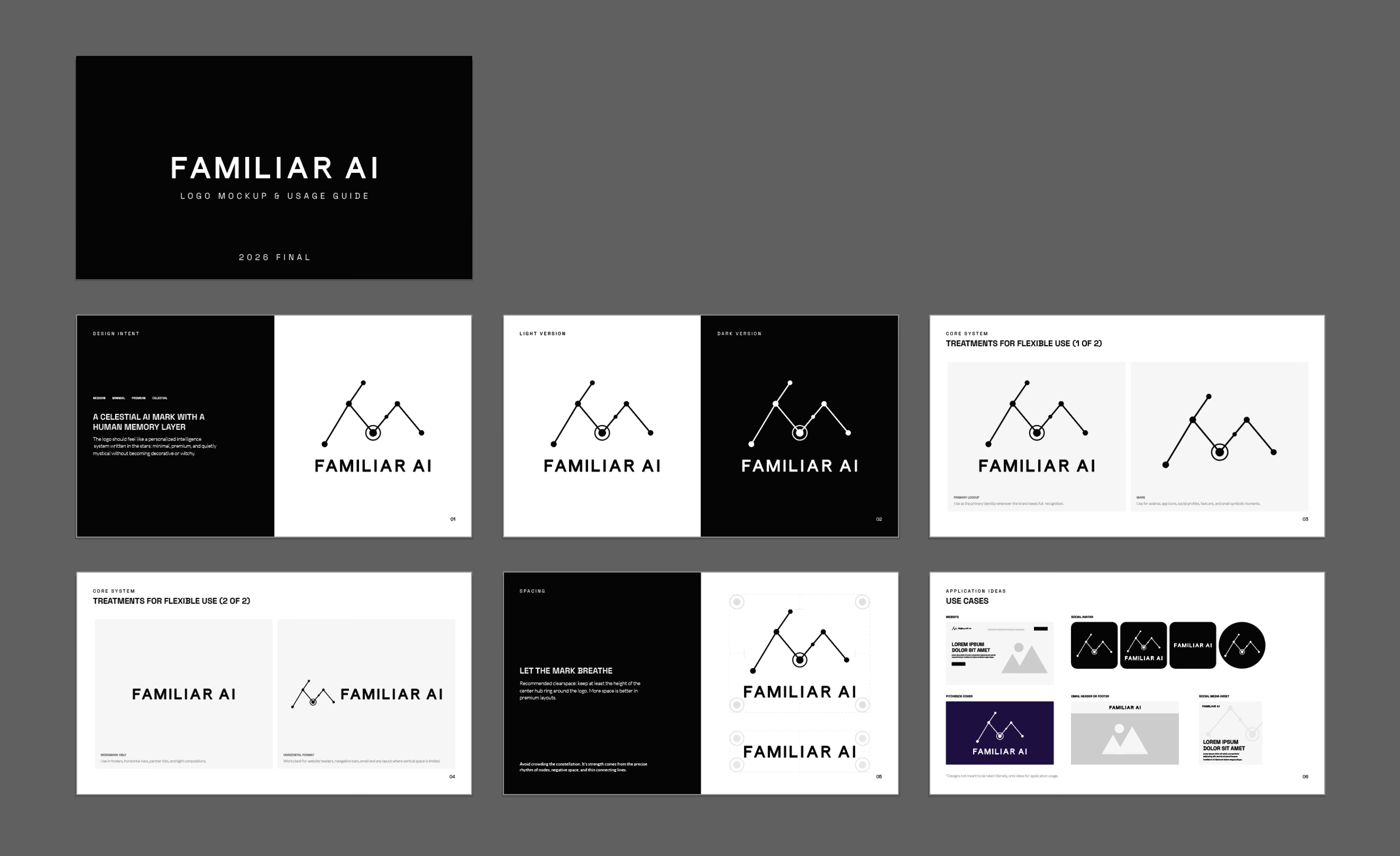
“Familiar AI Method.” The final system included mark-only, wordmark, and lockup variations, along with light and dark versions for flexible use across web, social, presentations, and branded materials. I also created a logo usage guide showing spacing, treatments, and real-world applications to help the client apply the identity consistently.
Branding for Aiste Hong
In early 2024, I was contacted by Aiste Hong in order to help her in the effort to create a visual identity for her high fashion brand company. Ultimately she did not choose to move forward with my branding efforts, however I am quite proud of the work I accomplished and feel it is a strong representation of the caliber of design execution I can create from scratch. I conceptualized her a branding deck with two possible directions we could go in with the hopes
My Contributions
that would direction would be "stronger" and thus we could narrow down our efforts to a singluar direction to iterate further on. The branding guide included color guides, typography, logo design, in context examples and texture work. The hope was to paint a semi complete picture of how things could look in the real world, perspective is always important when selling a branding idea to a client. Ultimately she decided my directions did not represent what she was looking for however regardless of that decision, I think this is a strong example of my capabilities.
Aiste Hong Logo Design
Logo design became a complex undertaking and we went in many directions in order to give Aiste a wide variety of ideas to move with. All of the logo work was designed in Illustrator and required me to sketch out ideas out on paper to which I would then fully customize and tweak them to perfection in a digital space.
My Contributions
While certainly some designs were stronger than others, its always good to flex your creative brain and tryout various directions, especially when a client is unsure about what they are looking for. As seen below there were 8 logo directions displayed on both white and black backgrounds.